
Four Lessons in Four Wins: Learnings from Our OMA Awards Journey
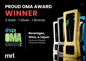
This year, for the first time ever, The MRL Group entered our industry’s most prestigious and longest-running awards competition: the 68th Annual Shop! Association OMA Awards, which recognizes excellence in retail display and merchandising design.
We were deeply proud of the work we submitted, but we entered humbly — hoping to learn something about the awards process, about the standards, and about how our work stacked up alongside some of the best in the industry. We certainly didn’t expect to come home with four awards — two Golds, one Silver, and one Bronze — or to emerge as the most-awarded agency in the beverage, wine, and liquor category.
Since bringing home our wins, The MRL Group team has spent some time reflecting on the experience.
Of course, the recognition itself is gratifying. It validates the quality of the thinking, creativity, engineering, production, and execution that goes into the work we do every day. But awards only recognize the final result. For us, the real story is everything that went into making those results possible and the lessons we learned along the way.
Taking a closer look at our four winning programs, we were able to extract a thoughtful lesson from each – something tangible and meaningful, and something we can take forward into future programs to make them even stronger for our clients.
To be clear, these weren’t lessons learned in a conference room. They came from being deep in the process, from solving problems, refining details, navigating constraints, and bringing ambitious ideas to life.
If we could, we’d put these lessons on the shelf right beside our shiny, new trophies. Instead, we’re writing them up right here.
Lesson 1: Bringing the Digital into the Physical
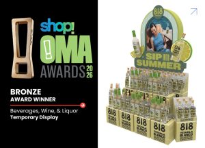
818 Tequila is a digitally native brand with strong cultural visibility and immediate visual recognition. The challenge with developing a strong retail presence for the brand was in translating existing brand equity into a physical environment without losing the energy that makes it resonate online in the first place.
In other words: how do you take something scroll-stopping and make it cart-stopping?
To do that effectively, our team focused on dimensionality, scale, and instant recognizability. The display leveraged the brand’s existing visual language, including the iconic bottle silhouette and highly recognizable label, and transformed it into a bold 3D retail experience that commanded attention at a distance.
The concept itself, of course, was only half the job. Execution mattered just as much.
Creating the final display required detailed refinement of 2D artwork to ensure it translated cleanly into vac-formed 3D structures. Every component had to be evaluated individually to maintain visual consistency once assembled. The display also needed to be modular enough to flex across different retail environments while still being simple enough for seamless in-store execution.
Today’s retail environments aren’t just competing against other products on the shelf. They’re competing against the entire attention economy.
Brands that win are the ones capable of creating continuity between the digital and physical experiences, ensuring shoppers instantly recognize a digitally native brand when it shows up at a physical point of purchase.
Lesson 2: In-Store Experiential Moments Convert
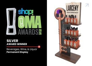
When Larceny prepared to launch a new package and campaign, the goal was to leverage in-store physicality to create a moment of discovery and interactivity.
The brand already had strong storytelling equity built around the idea of unlocking something unexpected. Our challenge was translating that story into a physical retail interaction that shoppers could experience firsthand.
The resulting display centered around an illuminated keyhole designed to reveal the bottle’s hidden UV ink treatment under black light — a feature that worked beautifully in bars and nightlife environments, but presented a unique challenge under fluorescent retail lighting.
Solving that challenge required both creative and engineering collaboration. Our team developed a motion-activated, battery-powered black-light system integrated directly into the display structure itself. When shoppers approached, the keyhole illuminated the package, revealing the hidden glow effect and creating an unexpected moment of interaction in the aisle.
What made the display successful wasn’t simply the technology. It was the thoughtful approach to interactivity. This wasn’t experiential for experiential’s sake. It was interactivity rooted in the brand story and designed to immediately reward consumer curiosity.
Lesson 3: Great Retail Design Starts with Underlying Human Behaviors
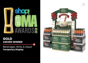
Holiday retail is crowded, competitive, and visually overwhelming. During the OND season especially, brands have only a few seconds to communicate relevance and capture shopper attention. For Evan Williams Eggnog the solution became all about tapping into an existing consumer behavior – something codified, understood, and easily communicated in an instant.
The oversized eggnog glass, cinnamon sticks, and unmistakable seasonal cues worked because they immediately triggered recognition. Shoppers didn’t need to decode the display or figure out what it was trying to communicate. They understood it instantly.
That’s an important lesson in retail design: award-winning work meets consumers on the journey they’re already on.
At its best, retail merchandising reduces friction. It helps shoppers orient themselves quickly, reinforces familiar rituals, and creates shortcuts to decision-making inside busy environments. In this case, the display wasn’t just selling a product. It reconnected shoppers with a holiday tradition they already associated with gathering, celebration, and comfort – and made the purchase decision effortless.
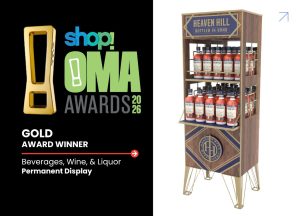
Lesson 4: Premium Works Best When It Feels Believable
When Heaven Hill approached us about developing a permanent display for their Bottled-in-Bond portfolio, one thing was immediately clear: the fixture had to feel authentic to the brand’s premium positioning and heritage.
Consumers are incredibly good at identifying when “premium” is superficial, which meant that every material choice, finish, proportion, and detail had to reinforce the craftsmanship, credibility, and history behind the product itself. The display needed to function less like temporary POS and more like a permanent piece of furniture — something that felt appropriate inside premium retail environments and believable alongside the product it represented.
That meant balancing aesthetics with durability, functionality with refinement, and visual impact with restraint. To that end, dark walnut tones, matte gold metalwork, structured geometry, and architectural detailing all worked together to create a display that communicated permanence rather than novelty.
Premium environments work best when every component — product, packaging, materials, structure, and storytelling — reinforces the same message consistently.
What These Wins Really Represent
While each of these programs solved a very different challenge, they all shared the same underlying goal: creating retail experiences that work in the real world. That means balancing creativity with engineering. Brand storytelling with shopper behavior. Visual impact with scalability. Innovation with execution.
The awards are something we’re incredibly proud of. But what matters even more is what they represent: a team that cares deeply about doing the work well, solving problems thoughtfully, and building retail experiences that connect design with commercial performance.
We’re grateful to our clients and partners for trusting us with that responsibility, and we’re even more excited about what comes next.
Want to develop award-winning retail experiences with The MRL Group?
LET’S TALK | LEARN MORE ABOUT WHAT WE DO